What Office Paint Colors Help Improve Focus?
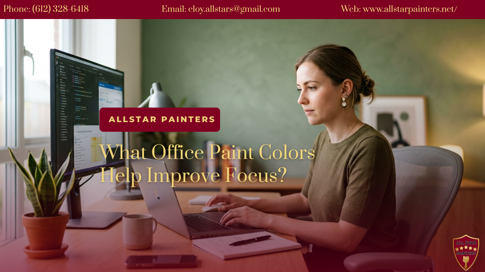
Table of Contents
- Introduction
- How Color Psychology Affects Workplace Focus
- Best Office Paint Colors for Focus and Productivity
- Office Colors Based on Workspace Type
- How Lighting Impacts Office Paint Colors
- Practical Tips for Choosing Paint Colors for Office Spaces
- Common Mistakes When Selecting Office Colors
- Conclusion
- Book a Professional Office Painting Service
- Frequently Asked Questions
Key Takeaways
- Office paint colors can influence concentration, comfort, and cognitive clarity in work environments
- Cool tones like blues and greens are often associated with calm and steady focus
- Neutral office colors support flexibility and reduce visual distractions in shared spaces
- Lighting conditions significantly affect how paint colors are perceived throughout the day
- Choosing paint colors for office spaces should consider function, task type, and room size
Introduction
Office paint colors can influence how people perceive space, process information, and maintain attention throughout the workday. The choice of office paint colors matters because it can affect visual comfort, mental fatigue, and the overall atmosphere of a workspace for business owners, remote workers, and decision-makers designing functional environments in places like Eagan, MN.
Understanding how paint colors for office settings interact with lighting, furniture, and daily tasks helps create spaces that support steady concentration without overwhelming the senses.
How Color Psychology Affects Workplace Focus
Color psychology studies how different hues may influence mood and cognitive responses. In office environments, this does not mean colors directly improve performance, but they can shape visual comfort and perceived energy levels.
Cool colors such as blue and green are often associated with calmness and reduced visual strain. Warmer tones like red or orange are more stimulating and may feel visually active in small doses. Neutral colors such as white, gray, and beige are commonly used in professional settings because they reduce distraction and provide a balanced background for extended screen-based work.
The way office colors are perceived can vary based on natural light, artificial lighting, and room size. This makes context an important part of any color decision.
Best Office Paint Colors for Focus and Productivity
Selecting office paint colors involves understanding how each tone interacts with attention and comfort over time. Below are commonly used categories in workplace design.
Blue Tones for Concentration
Blue is often associated with calm and steady focus. It is commonly used in office spaces where analytical thinking or detailed tasks are required. Soft blues can reduce visual fatigue in rooms with long computer use.
Green Shades for Balance
Green is linked to balance and visual rest. It is often considered comfortable for extended viewing and may help reduce eye strain. Muted greens are frequently used in shared office environments.
Neutral Colors for Flexibility
Neutral office colors such as soft gray, beige, and off-white create a clean backdrop. These tones allow flexibility in furniture and decor while maintaining a low-distraction environment suitable for multiple work styles.
Soft Earth Tones for Comfort
Earth tones like warm taupe or muted brown can add warmth to office interiors without overwhelming the senses. These colors are often used in spaces aiming for a grounded and stable feel.
Office Colors Based on Workspace Type
Different office setups require different visual environments. The function of a space often determines the most suitable paint colors for office use.
Private Offices
Private offices may benefit from softer blues, grays, or muted greens. These colors can support sustained focus during individual work periods without excessive visual stimulation.
Open Workspaces
Open-plan offices often use neutral office colors to maintain consistency and reduce visual competition between workstations. Light tones help keep the space feeling open and organized.
Creative Work Areas
Spaces designed for brainstorming or design work may incorporate slightly more varied tones. Soft accent walls in controlled amounts can introduce visual interest without overwhelming focus.
Home Offices
For remote workers, home office colors often need to balance productivity and comfort. Neutral tones combined with soft color accents are commonly used to separate work areas from personal living spaces.
How Lighting Impacts Office Paint Colors
Lighting plays a significant role in how office paint colors appear throughout the day. The same color can look different under natural daylight compared to artificial lighting.
Natural light tends to reveal the most accurate version of a color. However, artificial lighting can add warmth or coolness depending on bulb type. LED lighting with cooler tones may enhance blues and greens, while warmer lighting may soften neutrals and earth tones.
When selecting paint colors for office spaces, it is important to test samples under both daylight and evening lighting conditions to understand how the color shifts in real environments.
Practical Tips for Choosing Paint Colors for Office Spaces
Choosing office paint colors involves more than selecting a preferred shade. Practical considerations help ensure the color works well over time.
Start by evaluating the primary function of the space. Task-heavy environments often benefit from calmer tones, while collaborative spaces may allow for slightly more variation.
Test paint samples on multiple walls to observe how lighting changes the appearance. Small sample patches help reduce uncertainty before committing to a full room.
Consider furniture and flooring as part of the overall palette. Office colors should complement existing materials rather than compete with them.
It is also useful to think about long-term comfort. Highly saturated colors may feel stimulating initially but can become visually tiring in extended work environments.
Common Mistakes When Selecting Office Colors
One common mistake is choosing paint colors for office spaces based only on trends rather than function. While trending colors may look appealing, they may not always support daily work needs.
Another mistake is ignoring lighting conditions. A color that looks neutral in a store may appear very different in a specific office environment.
Overusing strong accent colors is another issue. While accents can add personality, too much contrast can create visual distraction in work-focused areas.
Finally, not considering the type of work being done in the space can lead to mismatched environments. Analytical tasks, creative work, and collaborative meetings may each benefit from different color approaches.
Conclusion
Office paint colors play a meaningful role in shaping how a workspace feels and functions. While they do not directly control productivity, they can influence comfort, focus, and visual clarity. Understanding how color psychology, lighting, and workspace type interact helps create more thoughtful and practical office environments.
For businesses and individuals in Eagan, MN, selecting paint colors for office spaces is best approached as a functional design decision rather than a purely aesthetic one.
Book a Professional Office Painting Service
Choosing the right office paint colors requires careful planning, especially when balancing lighting, function, and design goals. Professional guidance can help ensure the selected colors align with the intended use of the workspace. Send us an email at eloy.allstars@gmail.com or call (612) 328-6418 to learn more about our services.
Book a Professional Office Painting Service for informational guidance and assistance in planning your office color project.
Frequently Asked Questions
1. What are the best office paint colors for focus?
Soft blues, muted greens, and neutral tones are commonly used in office environments where focus and visual comfort are priorities.
2. Do bright office colors improve productivity?
Bright colors can add energy to a space, but they may also increase visual stimulation. Their suitability depends on the type of work being done.
3. Are neutral office colors a good choice?
Neutral colors are widely used because they reduce distractions and work well with different office layouts and lighting conditions.
4. How does lighting affect office paint colors?
Lighting can change how colors appear throughout the day. Natural and artificial lighting may shift tones, making sampling important before painting.
5. Can office colors affect employee comfort?
Yes, office colors can influence perceived comfort and visual strain, which may impact how people experience long work sessions.